
Interactive tool
Fermata
A data-driven analysis of Bologna's entire public transport stop network, to find redundant stops without penalising the areas that depend on the service the most.
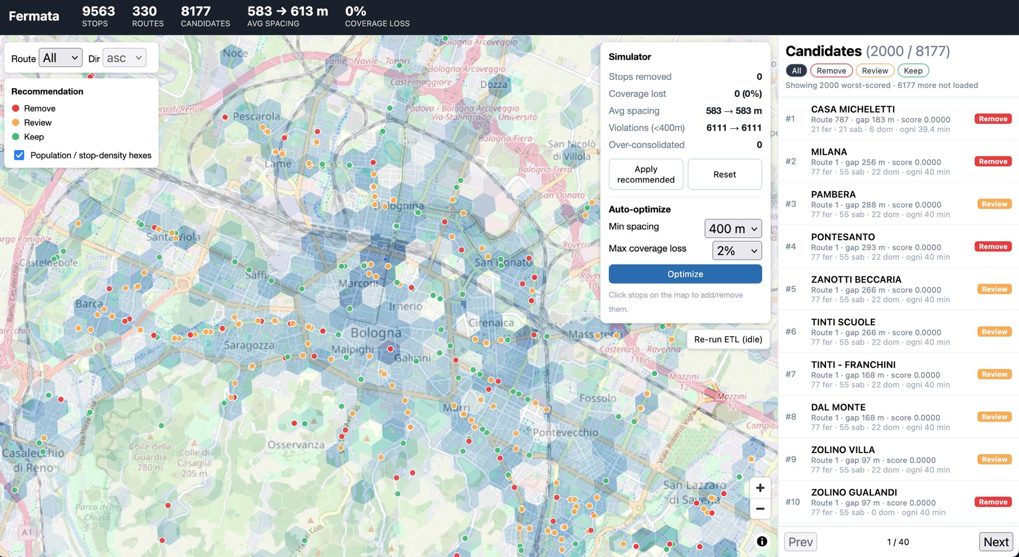
The problem
9,563 stops, no shared criteria for rationalising them
TPER operates 9,563 stops across Bologna's urban and suburban network. Understanding which ones are genuinely redundant — and which serve areas with few alternatives — means cross-referencing demand data, street network geometry and socio-demographic context, stop by stop.
Fermata is the tool we built to do this systematically and repeatably.
A network that grew over time
TPER's stop network expanded incrementally, without an overall review based on demand and accessibility data.
Overlaps that are hard to spot
Hundreds of stops sit close together on the same route, with no systematic analysis of their pedestrian catchment area (walkshed).
Risk for the most fragile areas
A 'linear cut' approach risks hitting exactly the areas with the fewest public transport alternatives.
The approach
A multi-factor score, not a linear cut
Every stop gets a score that combines real demand, geographic redundancy and social context — not just "how many passengers board". Stops are classified into three tiers: remove, review and keep, each with a readable explanation of the factors behind the score.
The stack: Python ETL pipeline, FastAPI backend, React/MapLibre frontend.
Bronze → Silver → Gold pipeline
GTFS data, boarding/alighting counts and the OpenStreetMap road network integrated into a reproducible pipeline on Postgres + PostGIS.
Multi-factor scoring
Historical demand, walkshed overlap (400 m) with adjacent stops, and presence of sensitive land uses (schools, hospitals, care homes) combined into a 0-100 score.
Equity layer on hexagonal cells
Population density (ISTAT data) and public transport coverage cross-referenced on a hexagonal grid, so already underserved areas aren't penalised further.
Conversational agent and reports
A Claude-based agent answers natural-language questions about candidates, simulates scenarios and generates PDF reports per line or area.
The results
A concrete proposal for the whole network
9,563
stops analysed across the TPER network
791
candidates for removal (~10%)
2,227
flagged for review (~27%)
5,159
to keep (~63%)
Percentages computed over the 8,177 stops actually evaluated by the scoring model (M9).
Try it
Explore the data
Filter stops by recommendation and score, and click a stop to see its scoring detail. The map shows an illustrative sample of the network — the full analysis across all 9,563 stops is available on request.
Conversational agent
Ask the agent
A few typical questions and the Fermata agent's answers, powered by Claude — including the regulatory sources cited where relevant.
Which stops on line 27 are candidates for removal, and why?
On line 27, two stops are flagged for removal: "Via Stalingrado 45" and "Via Massarenti 112". Both show very low demand (fewer than 5 boardings/day), and their 400 m walksheds overlap by more than 70% with the nearest stop on the same route. No sensitive land uses (schools, care homes, hospitals) fall within the coverage radius — a condition that, per the PUMS guidelines, would otherwise justify keeping a stop despite low demand.
Cited sources
- PUMS Bologna 2030 — Ch. 4, Public transport accessibility standards and sensitive land uses
What's the recommended minimum distance between stops in a dense urban area?
Regional guidelines for reorganising urban public transport stops suggest a minimum distance of roughly 300-400 metres between stops in dense urban areas. Shorter distances are acceptable where there are significant grade changes, complex intersections, or sensitive land uses (schools, hospitals, care homes) that require finer-grained access.
Cited sources
- Emilia-Romagna regional guidelines for reorganising urban public transport stops — Sec. 2.3
How is the removal-candidate score for a stop calculated?
The score combines several weighted factors: historical demand (average daily boardings/alightings), overlap of the 400 m pedestrian walkshed with adjacent stops on the same line, presence of sensitive land uses within the coverage area, and the equity-layer value (population density and public transport accessibility for the corresponding hexagonal cell). A low score (below 30) indicates a redundant stop with low social impact; a high score (above 65) indicates a stop that should be kept.
What happens to stops classified as "review"?
Stops in "review" status aren't automatically included in removal proposals: they require a closer look — for example a site visit or a discussion with the operator and local stakeholders (shopkeepers, schools, neighbourhood committees) — before a final decision is made. This step is consistent with the consultation procedures required for changes to the local public transport network.
Cited sources
- Emilia-Romagna regional regulation on local public transport service planning — consultation procedures
Which areas of the city have the lowest public transport coverage (equity layer)?
The equity layer cross-references estimated population density (250 m ISTAT data) with the walkshed coverage of active stops. Hexagonal cells with a coverage score below 0.4 indicate medium/high-density areas with poor public transport accessibility: these areas are flagged as a priority for keeping existing stops, even when the individual demand score is low, to avoid further penalising already underserved areas.
See the app
Screenshots and video
Screenshot gallery and video walkthrough coming soon.
Have a similar problem to solve?
If you have geospatial, operational or regulatory data to cross-reference for better decisions, let's talk.